






-

Marcos Ayash Profile
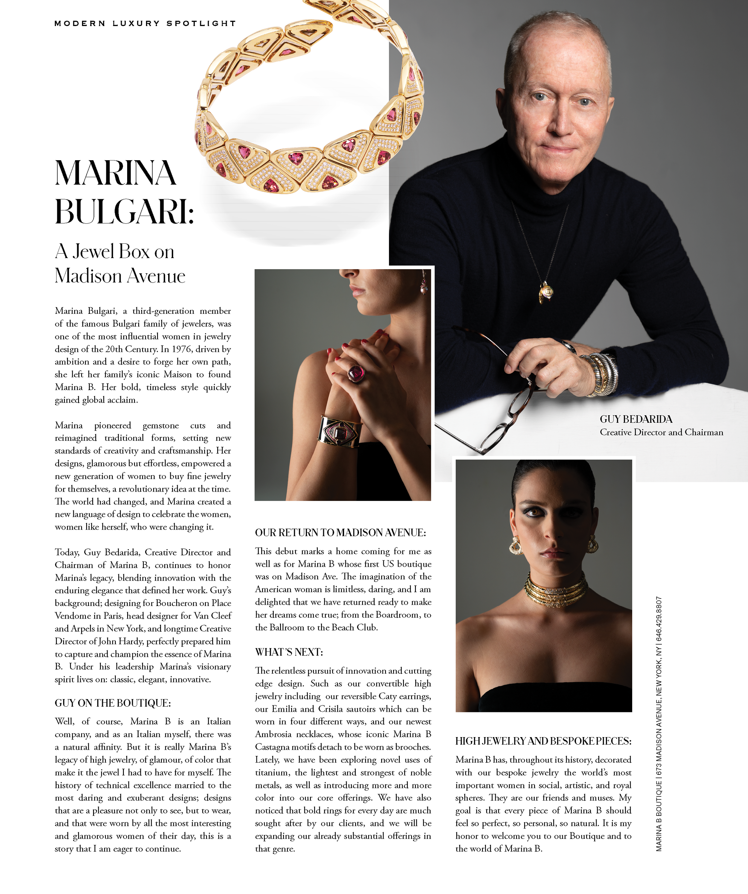
The profile feature for Marcos Ayash is designed to emphasize the headshot while simultaneously captivating the reader's attention and guiding them toward the "About Me" section. The layout seamlessly integrates the elements and creates fluid eye movement throughout the advertisement.
-

Ferguson Showroom - Design Space Highlight
The primary objective of this ad is to draw the reader's attention to the copy while strategically providing movement for the imagery to complement the verbiage. This design successfully balances the volume of copy and imagery, creating a harmonious composition.
-

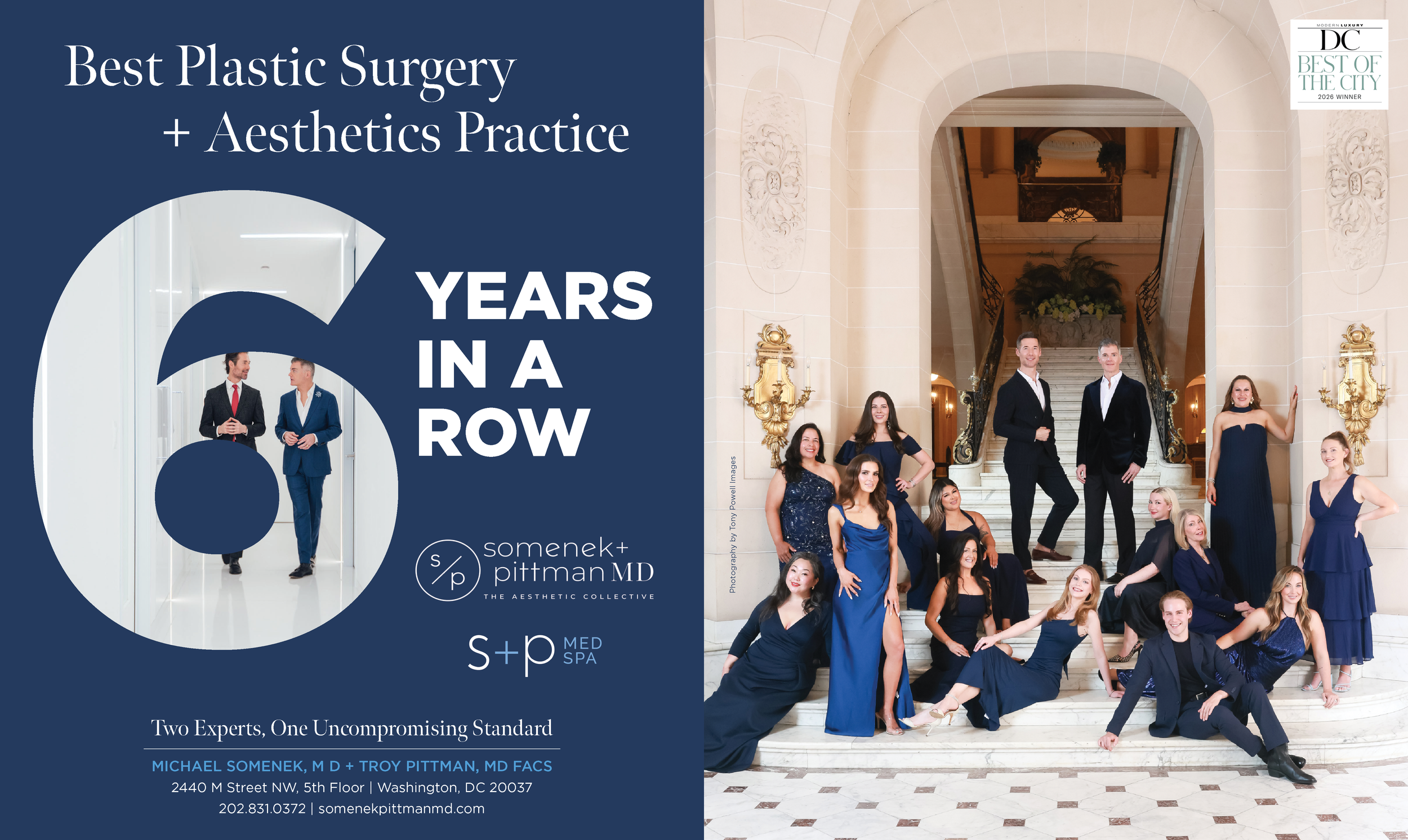
Somenek + Pittman MD
The image and headline work cohesively to guide the viewer's attention to the center and highlight the key message. Somenek + Pittman is strategically positioned along the trim of the page, to enhance the aesthetics, and seamlessly blend with the background.
-

Zero George Hotel
This exquisite spread showcases the multitude of amenities available at Zero George Hotel. The images are thoughtfully arranged with text integration highlighting specific features and offerings. Consistent grid placement allows the text to seamlessly flow to each page enhancing the visual experience for the reader.
-

Bella Bianca Bridal Couture
Synchronizing a white gradient with the wall accentuates the text, allowing it to stand out. The two-page spread elegantly captivates the beautiful bridal gowns while equipping the viewer with essential information to explore the boutique.
-

TKO Associates
The headline speaks to the layout, ensuring ample “space” between the image’s focal point and the copy. The contact information is placed directly from the sink’s angle, following natural eye movement. The simplicity adds to its appeal, enhancing the overall impact.
-

The Source - Cover
The white accent on the cover mimics the feeling of turning the page of a book. The background image retains its prominence amidst the white elements, adding a captivating and dynamic contrast between the white and blue colors.
-

Anderson Center for Hair & Aesthetics
With substantial information, the dynamic arrangement of numerical data and facts is placed in an organized, visually appealing layout. The hero image guides the viewer’s focus to the center, ensuring the content remains engaging without feeling overwhelming.